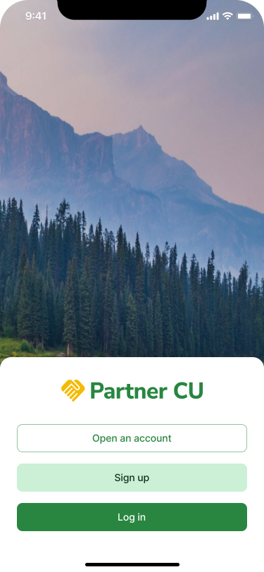
Candescent
White-label mobile banking
About Candescent
Candescent strives to be the leading banking platform provider for financial institutions (FIs), providing consumer-facing digital banking applications, and back-office administration tools.
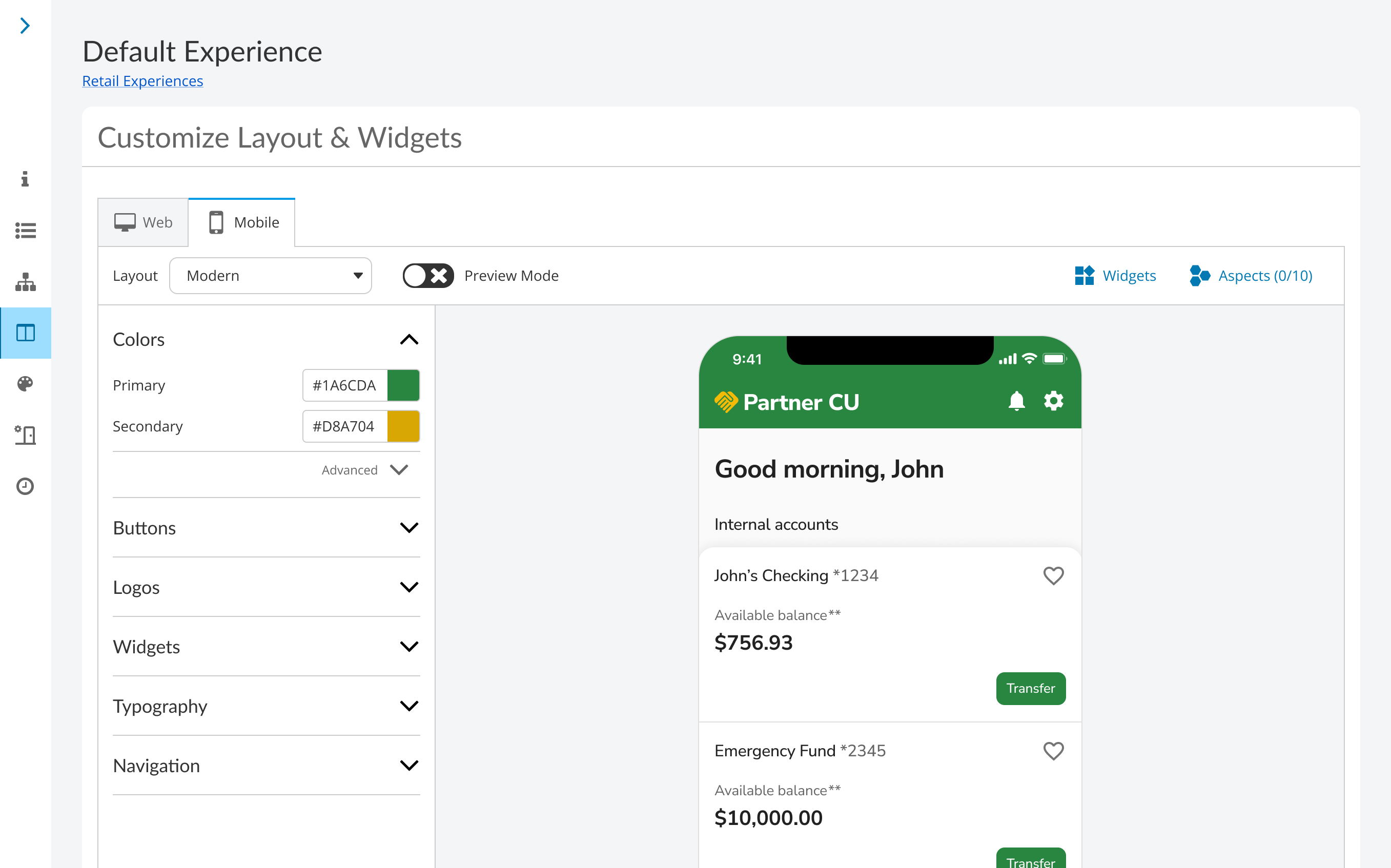
I led design for both, crafting the experience for admins to customize and configure their online and mobile channels, and the white-labeled mobile app for consumer and business banking users.
The problem
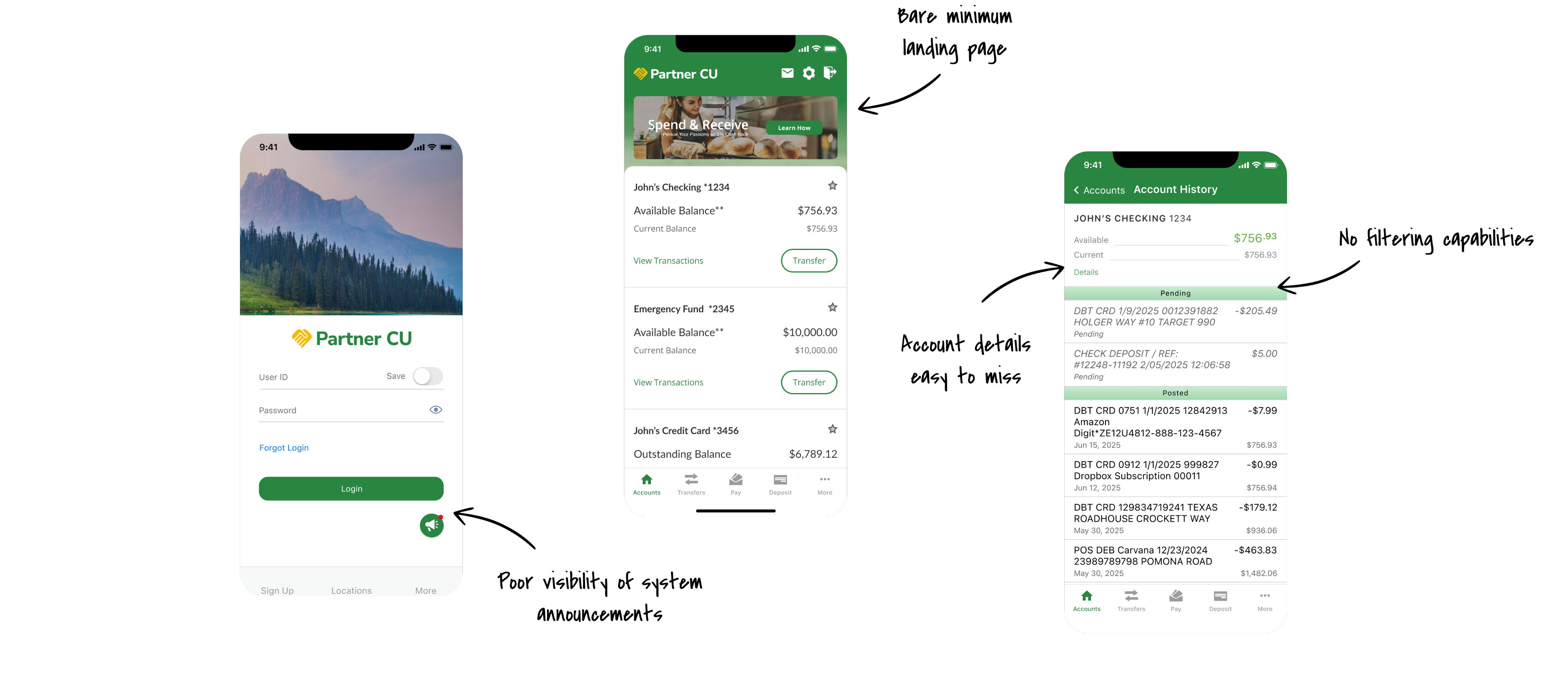
Financial institutions were switching to other digital banking providers due to Candescent’s outdated design, poor usability, and lack of mobile features.
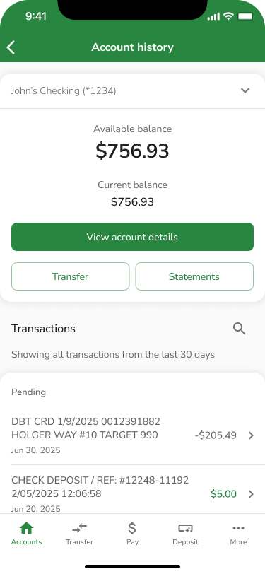
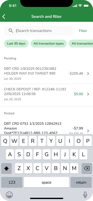
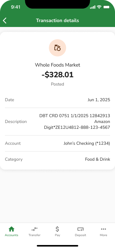
Users lacked functionality that was only accessible through online banking, causing a huge parity gap between web and mobile.
Building the understanding
To understand pain points and frustrations financial institutions had, I sought out opportunities to hear directly from them.
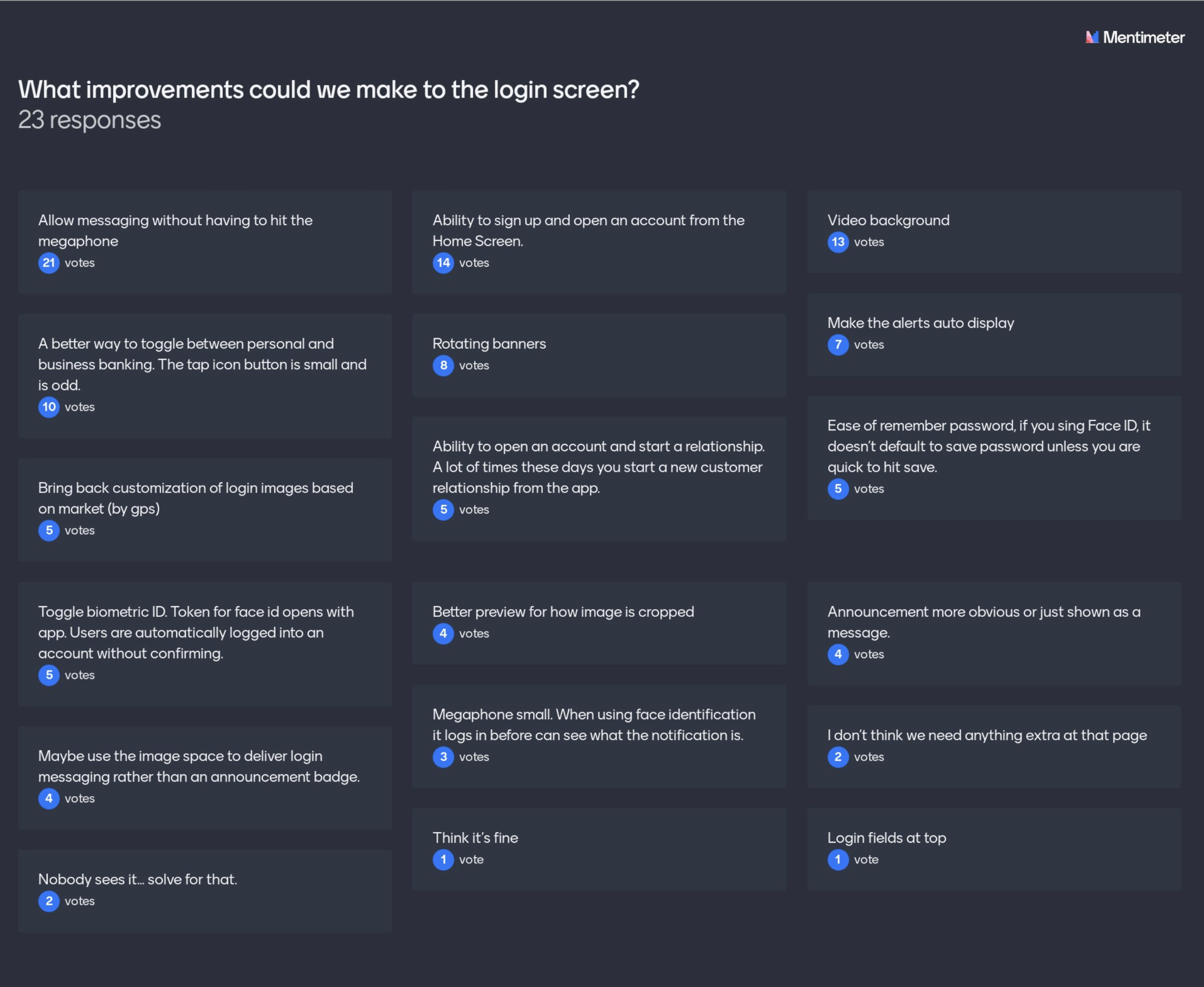
At our annual client conference, I held a design workshop to build a foundational understanding, asking general questions like, “What frustrations do you have about our mobile app?” and as granular as “What improvements could we make to our login page?”
By using live feedback tools, we crowdsourced ideas on general usability improvements, feature opportunities, and customization enhancements.
Deciding how to start
With so much feedback to absorb, and multiple rounds of gathering it, design enhancements became difficult to prioritize.
Through a concerted effort with product and engineering, we weighed enhancements by effort vs. impact, end user expectations, and technical effort.
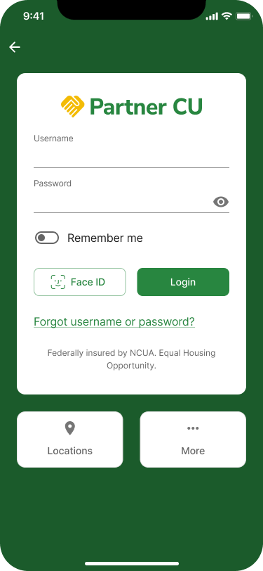
Taking the information architecture from the current app and identifying areas with the highest user traffic, we focused on the following: Login, Accounts, Account history, and Check deposits.
To be continued...
I hope you enjoyed reading so far! This full case study is still a work in progress, but I thought imperfection is better than nothing.
If you’re interested in learning more, please don’t hesitate to reach out!